(which you can simply disregard)
i really cant disregard the warning that i left noscript over. it was patently false, discouraged use of an important security feature, and had the disable checkbox checked by default.
noscript does work absolutely fine with palemoon, and the developer was basically lying to say otherwise. the wording of the warning was completely absurd and false and misleading.
i trusted the pm developer to produce a browser that i typed my site passwords into. after that nonsense, i didnt trust him to produce software that i install on my machine. his arrogance level is about 8.5 on the shuttleworth scale. "don't trust us? erm, we have root." to be fair, pm never fed plaintext local search queries to amazon.
following the authors "advice" would be bad for security though. "dont use a plugin that protects you from malicious software, because i get blamed for things not working!"
i try to use software i can actually recommend to people. i cant recommend pm to anyone, because it lies to them and tells them to do things they shouldnt do, which id have to explain "ignore that, hes full of it." pass.

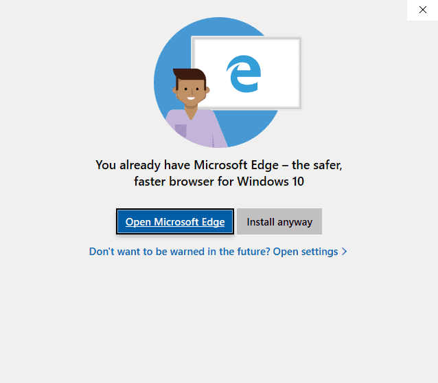
the parody of the dialog with the wording flipped. you could disregard the pm dialog like you said (actually design-wise you cant just disregard it, as i will explain) or, you could click "more information" and get lied to a bit more.
i dont think this is an honest mistake. this is a situation where a free software developer uses windows-like lies in a dialog to mislead the user into doing things his way, just for his own convenience or preference. he should go work for canonical. if you dont agree, you dont agree. but i think theres no excuse for it.
note that there are two buttons on the real dialog, that say "restart later" and "restart palemoon."
neither of them uncheck the disable box. the expected behaviour of a dialog like this is to have a cancel button where the red x is, which does nothing. but either button will disable noscript if you arent paying attention. this is extremely dirty (dishonest) design, some of the worst ive encountered in a decade. this business belongs in the non-free software world, where it came from. no one should use pm as-is, as it endorses this unusually bad behaviour towards users.
of course, they can choose to regardless.
i got this very atypical, windows-10-upgrade-like dialog first thing in the morning. if id clicked "cancel" (design-wise, it is and would be expected to be, a cancel button) in a groggy moment, which i didnt do-- id be a lot angrier. instead i just stared at the dialog for a minute and puzzled over it. im surprised anyone endorses pm after this.
designing dialogs to trick a less-than-always-vigilant user into doing something undesired should be left exclusively to malware and windows upgrades, where it is commonplace.

